About Me

My photo
Hello, Im Katie Alice Carter and I have set up this blog in order to present my progress over the A Level media course. Look around and hopefully enjoy my work. x

Wednesday 30 November 2011

Evaluation :)

In what ways does your media product use, develop or challenge forms and conventions of real media products?

The key features of a student magazine front cover will be a prominent picture usually mid shot mainly because it immediately draws the students eyes to the magazine, also a catchy and bold title because it will either relate to the students or not and allow them to identify the magazine. Lastly the cover lines are important again because this will be the decision maker on wheather they purchase this magazine or not and the basic layout of where all of these components are placed. I have included all of these key ingredients and I think my title "Wild" relates to my target market audience of females from year 11 to year 13 excellently. Another basic quality to have when designing a magazine is to make sure the colours used are good against each other and contrast well, allowing easy reading for audiences. My magazine consists of all these key elements which I think are of a high quality and connects well with the students. On my front cover I have added a dog paw which interlinks with the title "Wild" to put my price in to inform the buyers how much it will cost. This makes my magazine more aesthetic for the teenagers to look at but also takes a way the dominance of the price.

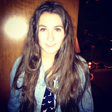
A contents page is basically a page informing the audience on what the magazine is about, what is consists and will navigate you to all of these places. It is usually made up of a headline, cover lines, page references and occasionally contain pictures. Pictures can be very important in the contents page especially for teenagers as they will instantly look at them making them either want to read that article or not. I have added a letter from the editor, which is me and added a picture of the editor. I that was good to include so students can get a feel for what this magazine is about and why it has been produced. Throughout this whole process I always look at each comments posted on my blog to make sure i take in and improve on what watching audiences were commenting on whether it was positive or negative feedback.

Overall I feel like I have challenged forms and conventions of real media products because student magazines are usually quite serious and based around the subject school, compared to my magazine, firstly being called "Wild" and being more of a gossip magazine. Also I went for the target audience of just girls which excludes a big group in society.

Here we can see the differences of a usual student magazine or school magazine, compared to my student magazine.
                               

How does your media product represent particular social groups?

My magazine is mainly targeted at students from year 11 to year 13, and for females not males. I have made both the front cover and contents page quite stereotypical of girls around this age because it looks very gossipy and girl like, for example using the colours pink and having catchy titles. The language I used was very colloquial and quite young so that the audiences can relate themselves to the magazine. The main picture on my front cover shows a girl doing a wild pose, making it quite fun and laughable, also she is of the audiences age. This picture being the only picture on my front page as well as being the main focus on the page immediately attracts the students eye to my magazine. I did not put much text on the front cover purely because I think students will get bored reading lots of texts. My headline and coverlines are very short and too the point as well as being quite funny.
 For my contents page I have got a lot of text as I have mentioned all of the coverlines throughout the magazine, the page references and the letter from the editor. But I have also a lot of pictures of my contents page making the text to picture ratio only a little bit higher.

My magazine has definitely been targeted and represents the stereotypical life of females and gives students from year 11 to 13 a selection of what they will want to read and are interested in.

Here is a gossip magazine but not aimed at students but all of the public.


What kind of media institution might distribute your media product and why?

My magazine can be distributed in our school although a school magazine has already been published and handed out to many students, as well as one that is sent home to parents. My magazine differs from the school magazine that has been given out because it has a specific target group, and I think would sell really well to all of the targeted audience. A lot of schools do have a student magazine in order to inform students what is happening around school, news and events coming up. Most of these student magazine's are very serious and basic, especially the ones that are sent to parents as they are very informative. "Wild" my magazine lies on the edge a little because it is very different due to it being mainly evolved around gossip and celebrity news. But I have included advice columns and tips on how to cope with school work and how to get into university so this could open it up from not just the targeted audience but many more people.

Who would be the audience for your media product?

After handing out my questionnaire and asking many people of both genders and all ages to fill out the form I came to a decision of who my targeted audience would be. The audience of my magazine will be of students from year 11 to year 13 so from the age range of 15 to 18. It is a female dominated magazine as this was voted as the highest option in my research, and all of the components included within my magazine is very girl orientated. I have included some stories on how to help balance your studies and partying as well as many tips on how to keep up with work, which could be focused for boys. Also my magazine could be aimed at girls who are either younger or older then the targeted audience as some of the stories may interest them.


How did you attract/address your audience?

Many people buy magazines on the spur of the moment and their immediate attraction is to the front cover. The front cover should take the most time to make and be drafted a number of times to make sure when it is in competition with other magazine it stands out to the audience. For my front cover the main focus was a big mid shot photo of a girl doing a mad pose, which will grab most students eye and attract them to the magazine. Bright colours was one of the main elements that I considered when designing my both of my pages, as you need colours that are well contrasted together and will stand out. Another prominent key when designing the front cover is the language used, which I made quite informal, young and even laughable for example when I said "Bluff your way to uni!" Also on the contents page after reading comments posted and taking into consideration the audience's feedback I made my letter from editor very friendly, to make sure readers felt that they could relate to the chatty tone used instead of getting bored by it. I think my magazine would stand out from a lot of other student magazines due to the coverlines being quite funny, bright colours being used, good quality pictures and even the masthead "Wild".


Final Contents Page :)

Down below is my final contents page :)


     Using my layout designs that I drew out I made this, my contents page using Microsoft publisher. Firstly I made my background black as I went with the colour scheme of pink and black which I think is attractive and quite girly. I then inserted both of my titles placing "Wild" quite big in the right hand corner, keeping it the same as my front cover to again show the brand identity. The main heading "Contents" is in the right hand corner also being very big showing audiences immediately what this page is about. Then I made two text boxes in which I typed out the text for both the many different cover lines and page references and a letter from the editor, who is me. I then using the insert picture button, placed many pictures onto the publication that relate to the cover lines in my student magazine like the "Interview with the PE teachers" and "Rihanna's new style".   

  This design changed from my last draft after reading the comments posted, as I have removed the page number as it isn't very relevant. Also I brought back the style of the title "Wild" from the front cover and put it on this contents page so audiences start to get familiar with the brand identity. I also changed my letter to make it more informal using colloquial language so that it fits the magazine's name, adding my name to make it looked signed by me. My page references and cover lines on the second column did not match up directly in a straight line so I have now changed this also. To add to my contents page I inserted the dog paw shape like on my front cover at the top of the page.


How is this varied from my layout designs?

I went with the design layout number 2 for this contents page, and I have just really duplicated it and haven't at all changed it majorly. I have changed the title "Contents" from being at a slight angle in the right hand corner and I did add the title "Wild" on the other side as well as a few images, which did fill up the blank space on the top left hand corner of the page. The cover lines and page numbers are kept in the same places, as well as the images underneath that relate with the cover lines. I have a letter from me the editor across the bottom of the page as well as a picture of the editor. Lastly I did not put any pictures at the bottom due to the amount of insufficient space.

Tuesday 29 November 2011

Draft of Contents Page


This is a draft of my contents page and is close to my finishing design.

Monday 28 November 2011

First draft of my contents page

Here is my first draft and my working progress of the contents page. I used the Christmas title because it is close to Christmas and is quite pretty. I have gone for the colour scheme of pink and black because I think these contrast in colours work great together, although some people may find it a little hard to read, so I will have to re search into this more. I soon will add pictures to my publication to make it more exciting and aesthetic. At the bottom I have the page number so audiences know what page they are on, also in the text box I have got the many cover lines and page numbers so readers of this magazine can navigate themselves around it. To improve this draft I may double up the writing so that this one big text box does not fill up this whole page.

Sunday 27 November 2011

Titles for contents page

Again I have been on "Dafont" and chosen a selection of fonts for my contents page. The title is basic and is just "Contents" explaining what this page is. Down below is a choice of fonts, ranging from Christmas fonts to horror fonts. Please vote for your favourite :)

Thursday 24 November 2011

Final Front Cover :)

After a lot of thinking and designing this is my final front cover that I have made over the course of the week. After reading the comments on my blog and choosing my preference, I used one of my "dafont" titles which I then coloured in. Also I used a custom shape in the corner of a foot print which interlinks with the title wild, and used it for the cost of the magazine. My main coverline and banner is at the bottom of the page and summarises the main picture of my subject who I photographed. Lastly using the text tool I added the date and placed it under the corner of my mast head, then typed in three coverline also changing the font I used to include a range of fonts.


How it varied from the Layout Design?

I choose layout design number 1, where the focus is on the picture and the mast head. I had the cover lines, one main cover line and a graphic. I lastly added a banner to my design, and really that was the only thing that changed as well as where all these components where layed out. I had a banner and my main cover line at the bottom which was originally at the top.

Wednesday 23 November 2011

Background colors and image

After a hard decision of what photograph will be used I choose a mid shot of just one girl. Using the pen tool I selected around the girls head and body, selected the part I wanted and pasted it onto an A4 page. Clicking onto edit and free transformation it allowed me to enlarge my image across the page. I then choose the writing that I would to like to have on my front cover and pasted it at the top left hand corner of the page.
Now i am stuck for which background colour to use, here is a selection, please vote.


This is a comparison of coloured writing or keeping the writing plain white, please vote for what you prefer :)

A few of my pictures

Down below I have put a couple of my pictures that I have taken and may use in both my contents page and my front cover. I have many pictures so I will have to limit the ones that will be used and edit them to make them look the best they possibly can. I went to a number of different locations in order to capture a variety of pictures and I also made my subjects of the picture pose in a number of positions to relate to my title, "Wild".

Tuesday 22 November 2011

Layout Designs


I have drawn out two designs of each my front cover and my contents page, which I have planed and drafted using pencil first then black pen.


If you could vote on what design you think is the best and most suitable for my magazine it would be appreciated, thank you :)

Here below is my front cover, which both include a main image, the mast head, a headline, cover lines, a graphic and finally a banner.


 Front Cover 1                                      Front cover 2


Here you can see my contents page, which include a letter from the editor, the page numbers and references to the cover lines, also including relatable images, the title and an image of the editor: 


                 Contents page 1                                                          Contents page 2

Monday 21 November 2011

Exploring photoshop even more


Today I have found a picture of a famous actress and I have saved it and opened this image into photoshop. The main task was to select what part of the picture I wanted and play around with the many effects to make the picture more professional.


After selecting around the girl in my picture using the pen too I copied and pasted the image into a new file where I could enlarge the image across the page which I had change to make an a4 sized page. I also using the "T" tool imported text and changed the colour of it. My image was still only a little blurred but this is because my picture is from the Internet.

Title analysis

I have chosen for my name to be "WILD" because I think it will relate to for younger students then having quite a plain name. My magazine will give inside gossip, it will be very fun, and school related information will not be involved as much. I have re-searched many different fonts on a website called "Dafont" and have chosen six of my favourite. The following are my six designs:

Tuesday 15 November 2011

Organise A Photo Shoot

In order to produce a number of professional, good looking images for my magazine I will have to take into consideration everything within the frame. I will have to plan about the following:

-Locations
-People
-Costumes
-Lighting
-Angles


For my front cover I am going to take many pictures of a mid shot of two girls. I will take the pictures around school at different locations like in the corridors or on the stairs, and they will both have there school uniforms on. I will test out the different angle from high to low and a eye level angle. The only shot I will take is a mid shot because this is what the brief has asked for. The lighting will be ambient as I will be close to windows and doors, which will allow the light through.

Photoshop

After trying out photoshop for the first time, I have discovered many different tools in which I can make my picture look more professional and can adjust the picture to how I would like it. I first uploaded this picture into photoshop and this was the first design:


Using the many different layers that I choose I could copy and paste them onto a new file to create my final image. Here I have designed a restaurant menu:


I used a tool called the magic wand which selected the crab based on its colouring and I could grow the selection to make sure all of the crab was highlighted. I then copy and pasted it onto a new file starting from scratch, adjusting the crab's legs and adding more colours to make it more realistic. Also copying the lemons from the other picture and pasting them making another layer to this picture. 

  Using the Paint bucket I changed the background  to pink which made everything except the images of both the crab and the lemons pink. Clicking on filter at the top of the page, allows us to choose a texture of design which we can adjust the size of. Here you can see I have changed the texture on the side of my design.

After using photoshop and testing out a picture I now know how to use photoshop more clearly and it will be very useful to me when editing my photographs.

Monday 14 November 2011

Analysis of Questionnaire Results

Tally of my results

To gain a better response to my questionnaire I decided to print of a number of copies of my questionnaire and hand them out to the students within my school. Taking into consideration the posts on my blog and all of the hand written questionnaires I have come to the conclusion on what will be contained in my magazine and mainly the target audience.


After analysing my questionnaires it seems that a multiple number of students are interested in a school magazine and would like for it to be published monthly. The price that was opted frequently using my questionnaire was from £0.51-£1.00 and i agree that this is a fair range in price for a monthly magazine and my highest answer on my poll was £1.01-£1.50 so I have decided on a final price of £1.00. After handing out this magazine to all ages and both genders I have decided that this magazine will be made for mainly a female gender type and the age range will be from year 11 all the way through to year 13.

Included in the magazine will be:

  • Celebrity Gossip
  • Fashion
  • Events
  • Music and gigs
  • Jokes
  • Games
  • Pictures
  • Films and t.v
  • Advice columns

 Lastly there was a variety of names which were all just one word but quite catchy. I will have to really think about and test out different names for the magazine because I think it is a very important factor when designing a magazine and will catch the students eye.

Wednesday 9 November 2011

Textual Anaylsis

The Front Page


This front cover design is very colourful and bright immediately attracting the audiences eye and will definitely stand out from any other magazine. It has the price of the magazine to show possible buyers how much it will cost, contains many pictures making the magazine aesthetically pleasing. This magazine "Student ID" gives an idea of the possible audience where it says "New students!" maybe increasing the demand of buyers.The Masthead "Student ID" it written in bold and a serif font, also has a black box around the writing allowing us to recognize the Magazine and it contains cover lines showing what will be featured inside. At the bottom of the page text is printed which shows "All inside!" which may make the audience quickly want to get inside of the magazine.
  But i also do think that the colours clash a little bit and it makes it hard for the reader to read the writing, also this front cover look all a bit to much on a page because of the background design. On the cover it says "New Students!" which may turn out to be worse for the economical side of the magazine as it may make the magazine a niche product and only be aimed for new students instead of a range of students.


The contents page

The contents page

I think that this contents page is very interesting and gives a very clear idea of what is contained throughout the magazine. On the Left side of the page we have a column from the editor of the October magazine as well as a picture in the top left hand corner. This tells readers what is in the magazine and is very informal making it relatable for the target markets group. The heading on the contents page summarises up what this page is going to tell you about, which some students may want to read, or some may not want to spend time reading. There is a column going down the middle which briefly summarises all the different stories and gives reference to the page numbers. Lastly i think the way in which small images have been layed down the side of the column and right hand side of the page makes this page aesthetically pleasing. These images makes the page more interesting and breaks up all of the text. Next to each image it gives a page number and little quote that the picture describes.The only disadvantage on this page is that there is a lot of information on just this one page but then again that is what a contents page is used for.


From reviewing both pages i have found that the title on each the Front cover and the contents page is very important and i will need to take into consideration many different names which will work best. The colours used are very important as it will either attract the customers of the students or completely put them off buying it. Also when taking pictures i will need to make them look professional and use them in the most appropriate style throughout the magazine. The actual text written on the front page will entice the students to read the magazine, so i will need to put the most exciting stories etc. on the front cover as well as the best looking pictures. On the contents page i will need to be clear to readers what article are where, and specifically show what is on each page. Lastly on each page i will need the best layouts so that my magazine is very aesthetic. 

Tuesday 8 November 2011

Analysis of two Student Magazine

I have looked through two student magazines, comparing and finding out what each had to offer and  the information that has been included.

College Life:

- This contains many pictures of the students participating in different activities.
- Text describing events throughout the year.
- Title's again giving the audience a insight of what the text will be talking about.
- The audience for this magazine is mainly targeted at parents of the students attending this school.
- It keeps reader's up to date with the achievements within the school.
- It also informs the audience about developments within the school.
- It does not contain a contents page but does have a column from the head master, sending out a message to the fellow readers about what this magazine contains.
- Personally this magazine's information and partly the layout will not be similar to mine due to the fact that our target market audience is completely different.
Common Sense:

- From looking at the front cover and reading the cover lines immediately we can recognise that this magazine will be for a student market.
- Its is full of information on different subjects.
-Throughout there are pictures in the magazine.
- It discusses life issues and all teenage relevant things.
- Also included are tests for students to complete, different t.v programmes and a little celebrity gossip.

Comparisons and similarities:

-The college life is aimed at a much older audience then the Common Sense magazine.
- Common sense is much more colourful and bright, especially the front cover, where as the college life looks more sophisticated and calm.
- Common Sense and College Life both have one main picture on the front of their cover, also college life has a small mid close up shot in the corner of a young boy.
- The main difference of the College Life and Common Sense is that the college life is much more formal then the Common sense magazine which is very colloquial.
- Also The common sense magazine has a contents page compared to the College Life which just has a speech written to the audience explaining what this books is about.

Monday 7 November 2011

Questionairre

This following questionnaire will be given out to many people in my school to fill out and also I will ask for people to comment on my blog. This will help me when it comes to making the front page and mostly the contents page. I will be able to identify my target market group, the gender type it will be designed for, also the actually content of what will be put in and included in the magazine.

Would you be interested in a school magazine?
Yes
No
Not sure

What years should the magazine be made for?
Year 7 (Elements) - Year 8 (Rudiments)
Year 9 (Grammar) - Year 10 ( Syntax)
Year 11 (Poetry) - Year 12 Rhetoric 1) - Year 13 (Rhetoric 2)
All Years

This magazine should be made for:

Females                 Males                   Both

What would you like to have included in this magazine?
(Tick any of the following)

-Celebrity Gossip         -Fashion
-Events                          - Sport
-Facts                            - News
-Pictures                       - Films and T.V
-Games                        - Music and Gigs
-Jokes                          - Careers Advice or University Advice
-Advice columns       - Competitions

How much would you pay for a student magazine?

£0.00          £0.50        £1.00       £1.50    £2.00       £2.50     £3.00          £3.01+

How often would you like this magazine to be published?

Daily
Weekly
Monthly
Seasonally

Any preferences or ideas to names?


Any additional Comments?


Thank you for taking your time to fill in this form :)

The Action Plan

Week of 7.11.11
- Set up a blog, Done
- Write action plan, Done
-Analyse at least 2 student magazines, Done
-Conduct textual analysis,Done
- Create a questionnaire, Done


Week of 14.11.11
-Analyse results,Done
- Design draft layouts, Done
- Organise a photo shoot, Done

Week of 21.11.11
- Take photos, Done
- Design and draft pages

Week of 28.11.11
-Test pages
-Evaluate final pages

Introduction- First Ever Post :)

My name is Katie Carter :)

This blog is purely for my media task, I have been ask to produce a student magazine where you can watch the process, of me fulfilling my brief. I will be making both a front page and contents page for the student magazine, re-searching, planning, taking lots of photos, designing and evaluating :)

I will upload everything onto my blog from the preliminary exercise, so all of you followers can check up on me ;)

Enjoy!!!!!!!!!!!!