Front Covers analysis
DJ Magazine
Published In- January 31, 1991
Published by - "Thrust publishing"
"DJ"magazine is dedicated to Electronic dance music, with the magazine being directed as the main target audience to DJs hence the name, as it is specific to all of the latest music that DJ's both male and females should be playing. The masthead "DJ" is written in big, bold, sans-serif, red font which stands out as the name and identification of the magazine. Also mentioned underneath the masthead "LIVING AND BREATHING DANCE MUSIC" this specifies again what kind of music this magazine relates too. The design looks quite hectic due to the many colours been splashed together having a mismatched appearance. The close up image of a man in a mask dominates the colour scheme as generally being red, blue, yellow and white. The image relates to the main headline "SBTRKT, THE MASKED MAN SPEAKS" so readers straightaway know this is the main feature.On this front cover it also gives away a free CD (freebie) to advertise the magazine and also will attract the readers eye to buying this particular magazine. This is again advertised at the top of the page where it says "*FREE SANTOS MULTIMEDIA CD! MUSIC AND DATA GALORE*". The font on the page has a graffiti style to it,which fits in nicely with the mix of colours. On the left side of the page there is a column with different cover lines which will show the most exciting and attracting features and articles inside this magazine. The cover lines are all grouped together and quite short also the writing is placed on a different coloured background. At the top of the page in the right hand corner there is a graphic advertising this magazine. In the top right hand corner there is a small graphic telling the audience that this is the "BEST OF BRITISH LAUNCH ISSUE". Lastly right at the bottom we can see the price of the magazine £3.95, which I think is fairly priced.
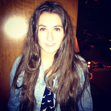
Uncut Magazine

Published in- May 1997
Published by- IPC Media
Uncut magazine is published every month which is based in London. It's main focus is on music but also includes films and T.V. The targeted audience for this magazine is from the range of 25 year olds to 45 year old men. The colour scheme here is mainly red and white maybe due to the colour of the top worn by the subject in the picture. At the top of the front cover there is a banner advertising different music albums, and just below is the main Masthead "UNCUT" which is in a serif font and quite bold. The masthead also interlinks with the colour scheme as it is mainly white but with a red lining surrounding the letter. On the cover there is a graphic advertising the free CD that is given away with the magazine which will make any person more attracted to this magazine. This front cover is based around one main mid shot of a women, with the cover lines layed out around it. Cover lines then fall around the picture both the right hand side and left hand side. The bigger font shows stories such as "The top 50 albums" which comes across as a main article to read, compared to the smaller writing that is written towards the bottom of the page. The font of the writing is quite normal and sophisticated giving it more of a classy look compared to most music magazine that come across a bit wild. Above some of the cover lines there is a little graphic with a title in for example "Artist of the year" and "plus".

This emphasis how much the magazine has inside, and makes the reader want to buy it. At the bottom of the front cover it tells us the magazine issue "January 2012" and the price £4.80 which seems like a fair price for the quality of the magazine.
Record Collector

Published by- Diamond publishing
Published in- March 1980
This magazine is the united kingdoms longest-running monthly magazine. It is based for the music industry for mainly ages from 20 to around 40 years old. This front cover has quite a long masthead title "RECORD COLLECTOR" and the two words are layed out on different lines. It is written in a serif font and is quite bold capturing the audiences eye. Also it has a Christmas effect as the use of snowflakes have been used, with a graphic saying "Christmas issue" and underneath a little sentence saying "Serious About Christmas". At the top there is a banner with different story lines like "How R&B became Reggae". Then a big headline "LED ZEPPELIN" is displayed which clearly interlinks with the band on the front of the magazine. The picture covers the page horizontally with cover lines Inbetween
No comments:
Post a Comment