Down below is my final contents page :)

Using my layout designs that I drew out I made this, my contents page using Microsoft publisher. Firstly I made my background black as I went with the colour scheme of pink and black which I think is attractive and quite girly. I then inserted both of my titles placing "Wild" quite big in the right hand corner, keeping it the same as my front cover to again show the brand identity. The main heading "Contents" is in the right hand corner also being very big showing audiences immediately what this page is about. Then I made two text boxes in which I typed out the text for both the many different cover lines and page references and a letter from the editor, who is me. I then using the insert picture button, placed many pictures onto the publication that relate to the cover lines in my student magazine like the "Interview with the PE teachers" and "Rihanna's new style".
This design changed from my last draft after reading the comments posted, as I have removed the page number as it isn't very relevant. Also I brought back the style of the title "Wild" from the front cover and put it on this contents page so audiences start to get familiar with the brand identity. I also changed my letter to make it more informal using colloquial language so that it fits the magazine's name, adding my name to make it looked signed by me. My page references and cover lines on the second column did not match up directly in a straight line so I have now changed this also. To add to my contents page I inserted the dog paw shape like on my front cover at the top of the page.
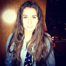
I went with the design layout number 2 for this contents page, and I have just really duplicated it and haven't at all changed it majorly. I have changed the title "Contents" from being at a slight angle in the right hand corner and I did add the title "Wild" on the other side as well as a few images, which did fill up the blank space on the top left hand corner of the page. The cover lines and page numbers are kept in the same places, as well as the images underneath that relate with the cover lines. I have a letter from me the editor across the bottom of the page as well as a picture of the editor. Lastly I did not put any pictures at the bottom due to the amount of insufficient space.
No comments:
Post a Comment